
Blue summer skies and starry watercolor night scenes are fun to paint, but dreary days deserve some love, too. Think of a snowy day, the pearly light of a cloud-covered sun illuminating the horizon. How about a November morning with drizzle so fine it tints the air with silver mist?
Sometimes painting a blue watercolor sky with white fluffy clouds just doesn't suit the mood. Whether you want your cloudy environment to convey emotion or just serve as a quiet backdrop for your landscape, here are some go-to tips for skies on the subtle side.
1. Keep It Simple
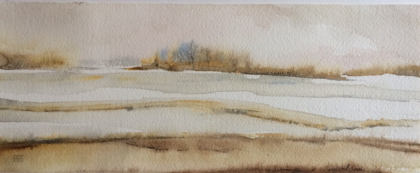
It's tempting to pull out allllll the colors, like if we're painting a brilliant sunset or a dark and stormy sky . But the subtle, atmospheric skies that we see in the fall and winter are almost always better when we stick to one or two colors, like in the winter landscape you see above. By sticking to a gentle, dusty rose hue, this sky makes a statement without overpowering the rest of the painting.
Pro Tip: "Keep it simle" does NOT mean make it flat. Feel free to mix in a pigment or two to give some variation to your sky — just don't go crazy, or you'll end up with a rainbow.
2. Complementary Colors Are Your BFFs

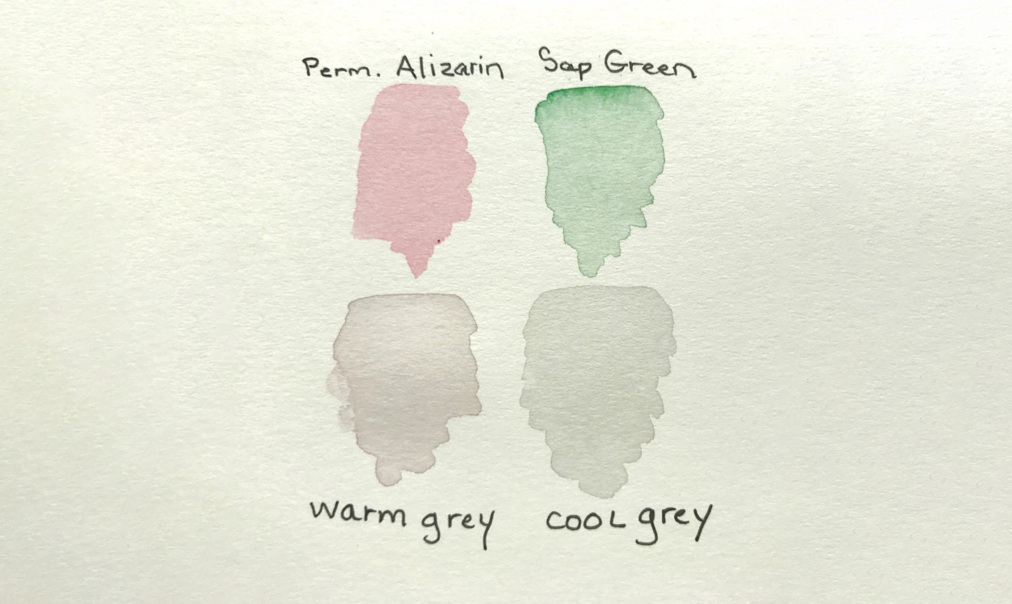
The key to nailing a moody tone in your painting? Mixing shades of gray. And to do this, you need to combine complementary colors.
Complementary colors are pairs of colors that, when combined in varying amounts, cancel each other out. This means that when combined, they produce a gray-scale color or a more muted version of one of the two colors used.
To find the complement of any color, simply look across from it on a color wheel. The main complementary color combinations are:
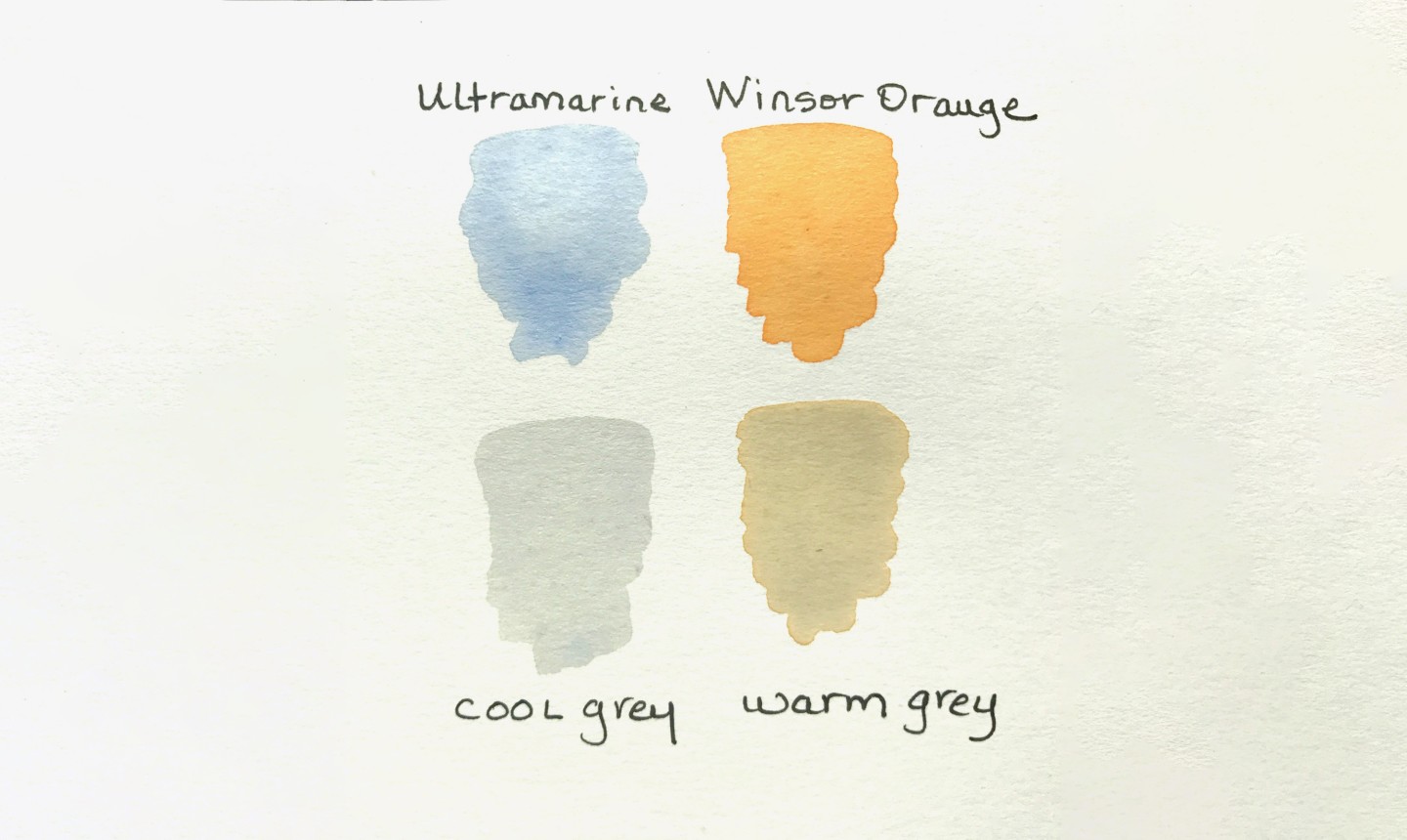
Let's put this into action. By mixing purple and yellow, we get a gorgeous muted gray.
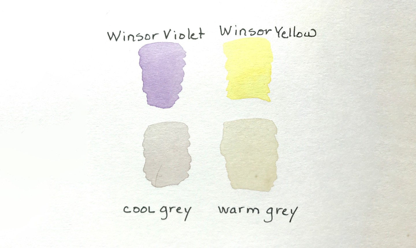
Depending on how much of each color you use, you can create a cooler or warmer gray. To see what this looks like in a finished watercolor piece, refer to the image below.
We mixed yellow ochre with just a touch of violet to create a quiet atmosphere that's in harmony with the other colors used throughout the painting.
No matter which complements you use, each combo creates warm and cool grays:
And here is an example of orange and blue:
3. Stick to Your Color Palette
Rule number one of any painting: you want to keep it harmonious. In other words, you don't want to create an entire landscape using crimson, ochre and green... and then paint a sky with a mixture of orange and blue.
So when you're going gray, do so by mixing complements that are already within your existing palette.
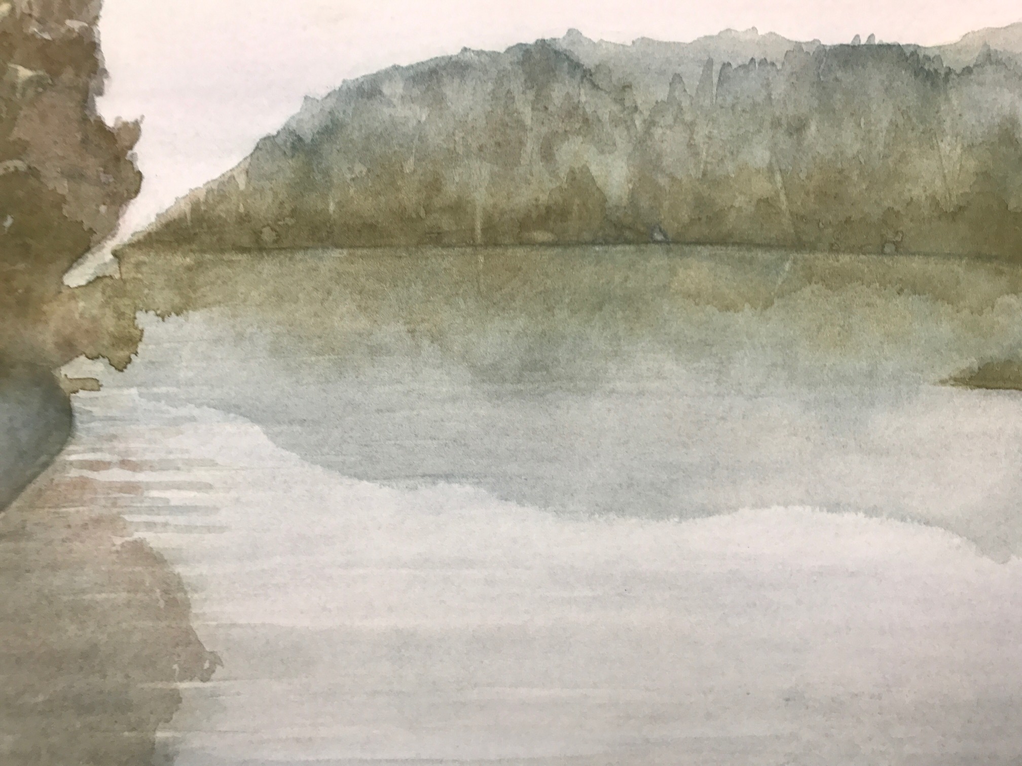
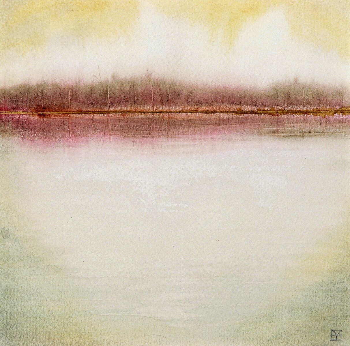
In the painting above, we used a limited palette of cadmium red, ultramarine blue, burnt sienna and cadmium yellow. We created muted, dull greens with the blue and yellow, and added a touch of burnt sienna where we wanted more warmth.
For the sky, we created a very diluted wash of cadmium red with a touch of the green from the trees. This color was also used in the reflection of the sky in the water.
Next time you're painting a scene that's a tad on the dreary side, play around with your complements and discover all the moody effects you can achieve!
Looking to get started with watercolors? Check out the class Startup Library: Watercolors below!


I’m new to this activity and your site. Can I create more playlists for videos I want to save? You give me 2, Favourites & Watchlist, but I want to add more playlists, such as acrylics, watercolours, drawing etc. I can’t see how to do this.
Where can I find a list of all your art and craft classes with prices, etc?