
You probably don’t need to be told this, but pen and ink is an incredibly versatile artistic medium. Subtle style variations can yield works which range from whimsical and clever illustrations to breathtaking and realistic drawings. Stories can be told, moments can be captured: It’s all a matter of your style and line quality.
Illustrations and photographs via CakeSpy
Regardless of your personal style, there are certain tips which can streamline your pen and ink technique so that you can focus on your artistic message.
Here are 7 simple tips to help make your pen and ink work sparkle.
1. Consider the end result
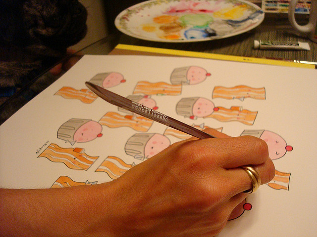
If possible, consider what you’ll be doing with the end result of your pen and ink drawing. If you have a specific goal in mind, this can help you make targeted decisions about what materials you use, as well as the scale of your piece.
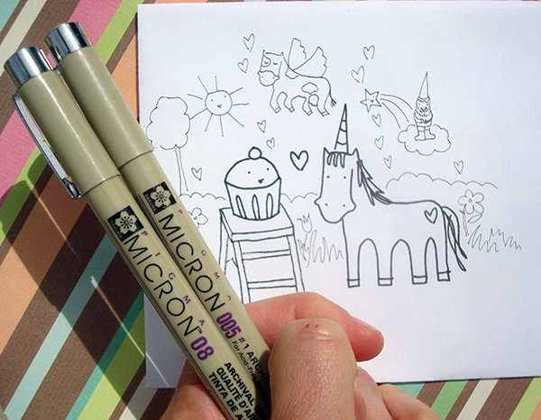
For instance, for a simple image designed to be printed as a greeting card or T-shirt, using a pen with a thick tip on a fairly flat surface to allow for clean scanning was in order:
Whereas images designed for a softer use can be rendered a little more delicately, such as the pages on a book. In this case you can use a thinner pen tip and draw on a paper with a little more texture, like so:
The softer texture is well-suited to a more delicate design:
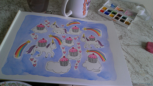
If you will be pairing your pen and ink with watercolor or another medium, be sure to use a pen with waterproof ink so that it won’t bleed once you add the second medium.
We can’t always know the end result of our artwork, but when possible, little decisions like these can really make your work more efficient.
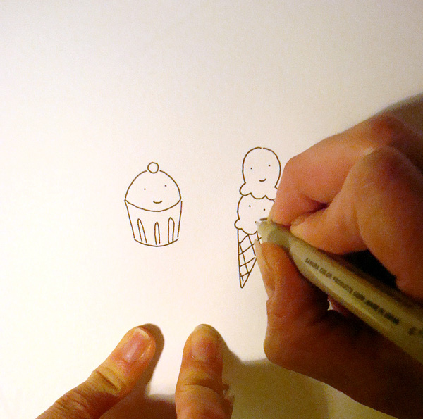
2. Use pencil before you make it permanent.
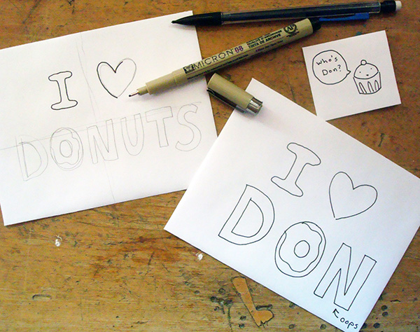
It’s a pretty simple concept: pencil can be erased, pen cannot. Using pencil to make a light sketch before adding ink can be helpful in making sure that you’ve attained the composition, perspective and size you were seeking. When you don’t have a “guide”, you can make errors in terms of spacing and composition.
3. Let the ink set before proceeding
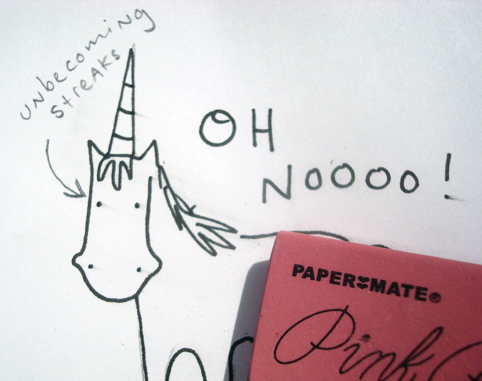
When using pencil as your guide, be sure to let the ink dry completely before erasing the pencil marks underneath. Even if you are using a waterproof ink, it can still streak if it hasn’t yet set on the paper. If you’re impatient, you can hasten the process by lightly heating the paper with a hair dryer: Just don’t hold it too close or you could burn the paper!
4. Mix ink thicknesses.
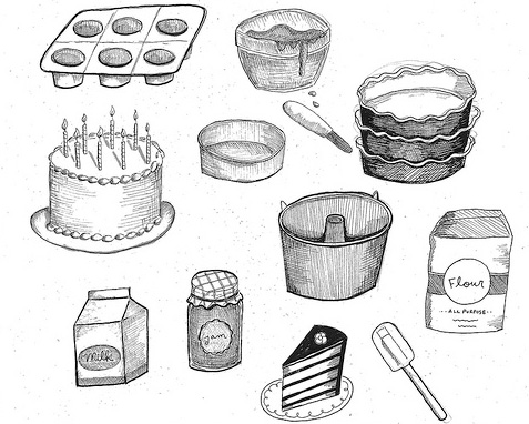
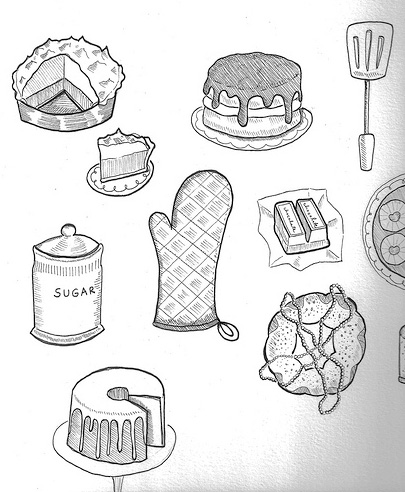
Make your drawing dynamic and dimensional by employing different pen tips. Using a thinner tip for further-away items can give a sense of depth to the piece and keep attention on the key components of the drawing.
See how the background items don’t “compete” with the foreground items? That’s because the thicker ink employed for the items in the foreground brings the eye into the center of the piece right away.
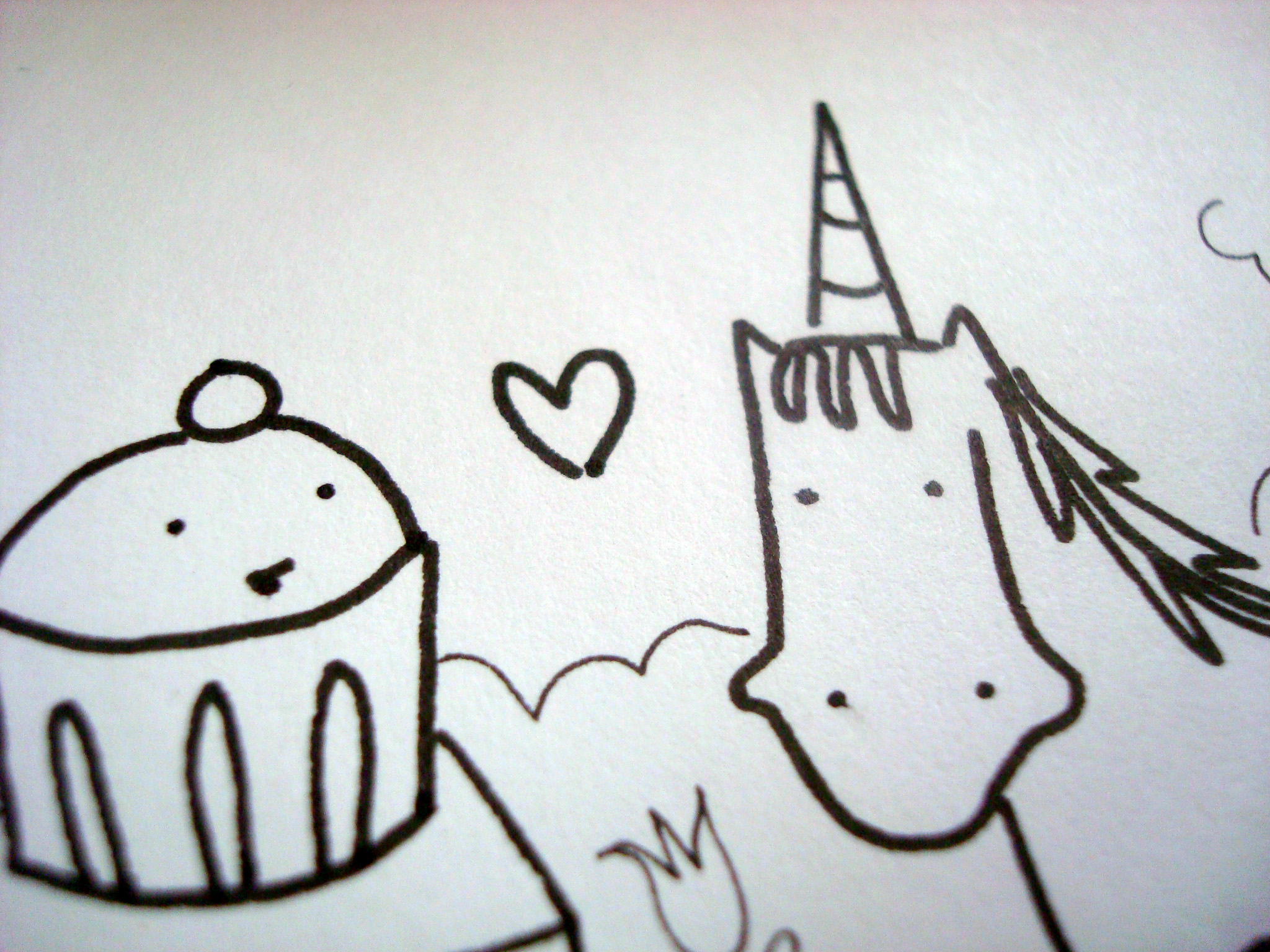
5. Create texture with your pen strokes.
Where the illustrations featured previously in this post feature strong lines, illustrations can gain texture and a distinct personality by using different pen strokes. In the case of the above illustrations, a combination of stronger lines paired with smaller, delicate lines adds up to a greater whole: a more interesting image.
Different pen strokes such as cross-hatching or pointillism can create texture, contrast , nd dimension. Try out various types of pen strokes to see which one feels right for you.
6. Use the right paper for the job.
There are many types of paper that are suitable for pen and ink. But, as previously mentioned, a little foresight about what you intend to do with your piece can be helpful in determining the best type of paper for the project.
For instance, a watercolor paper may look very cool, but if you’re using a quill pen, it can snag, break the tip of your pen and mess up your drawing. On the other hand, drawing paper may look fine for the pen and ink part, but if you decide to add watercolor, the non-porous paper will not let the paint spread in a pleasing way.
Generally, bristol board or illustration board are wonderful picks for pen and ink work. They are both fairly flat, so neither will tear up the tip of your pen, and the image remains crisp. Yet they are both absorbent papers, making it ideal for watercolor, marker, and acrylic in addition to your pen and ink.
7. Clean your hands.
This might seem like an obvious tip, but washing your hands before using pen and ink is an important step, even if your hands don’t have obvious smudges of, say, paint or chocolate (maybe that’s just me…) on them. The reason is that even a small amount of oil on your fingers can transfer to the paper, which can cause the ink to blur or look irregular. So even if you think your hands are clean, err on the safe side and wash and dry them thoroughly before using pen and ink.
Share tips, start a discussion or ask one of our experts or other students a question.
No Responses to “The Pen is Mightier: 7 Awesome Pen and Ink Drawing Tips”