
VersaMark ink is a “versa”-tile staple all stampers should have on hand. It is known as a watermark ink because when stamped on cardstock, it leaves behind a subtle yet slightly darker image, like a watermark. If used on light cardstock, the resulting image will be quite light while the results when used on darker cardstock are darker, more vivid.
 VersaMark ink is clear so stamps should be squeaky clean. If a bit of ink transfers from a stamp onto the ink pad, it may stain the pad, but it will still work. There is a chance, however, that the ink will transfer back to a stamp and onto paper. Where no color is expected, a shadow of errant color may appear. Sometimes this is not a problem but there may be instances where no color is required (i.e. clear embossing on white).
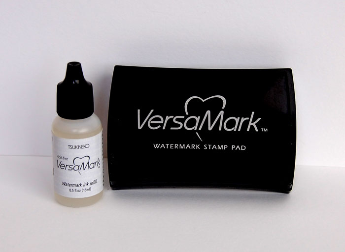
VersaMark is available in an ink pad as well as marker form. The marker is double-tipped with a brush end for coloring/embossing larger areas and a fine tip for adding smaller detail. The marker can also be used to correct mistakes where embossing powder may not have covered an area completely. Simply touch-up with the pen, add a bit more embossing powder and heat set.
How to use VersaMark ink
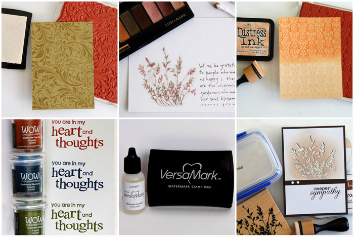
There are many techniques using VersaMark ink. I’ve included seven below ranging from very simple to a bit more complex.
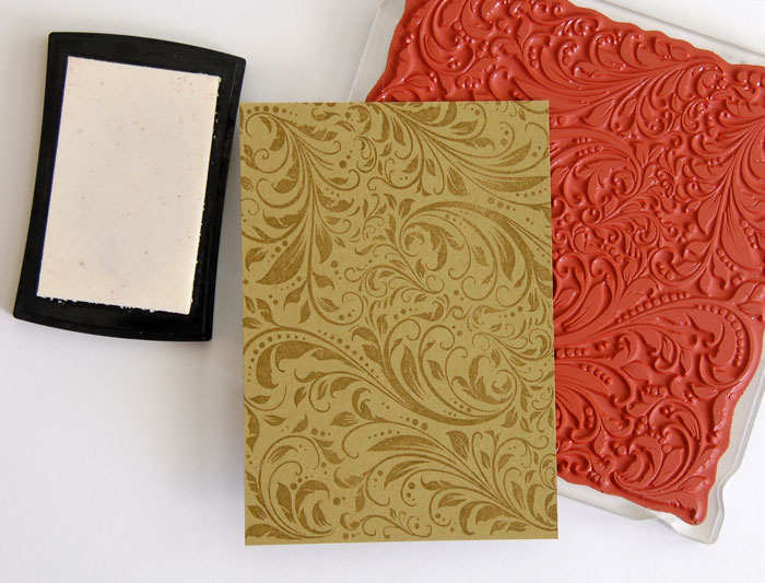
1. The basic watermark
One of the most common uses of VersaMark is creating a watermark. In the photo above, the stamp was inked with VersaMark and stamped onto the olive cardstock.
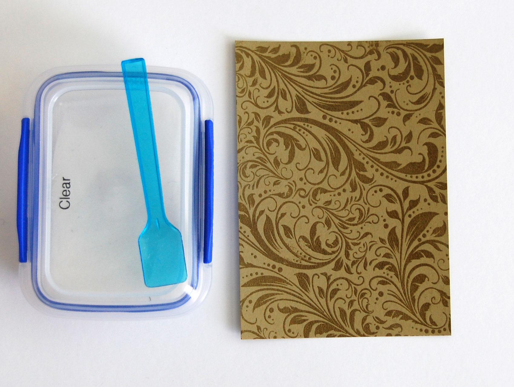
2. The embossed watermark
Since VersaMark is clear and sticky, it is perfect for use with embossing powder. To achieve a darker watermark, stamp image in VersaMark, then clear emboss. I recommend using a powder pouch or powder tool over the cardstock before stamping to ensure the embossing powder sticks only where wanted. Stray dots of clear embossing powder will show once heated.

3. A rainbow of (embossed) colors
Because VersaMark is clear, it is perfect for embossing using any color of powder. Liberally pounce powder pouch or tool over the area, stamp image or sentiment in VersaMark ink, sprinkle colored embossing powder over and set with heat gun.
4. VersaMark Resist
Resist areas are achieved by stamping VersaMark and allowing just a minute or two of dry time. Once dried, colored inks can be brayered, daubed or sponged over the VersaMark areas. For a more vivid resist, clear emboss before adding colored ink. Once the color is added, use a paper towel or baby wipe to remove ink that is lying atop the VersaMark areas to reveal the white cardstock beneath.
On the sample above, I used glossy cardstock. The same technique can be used on regular/uncoated paper.
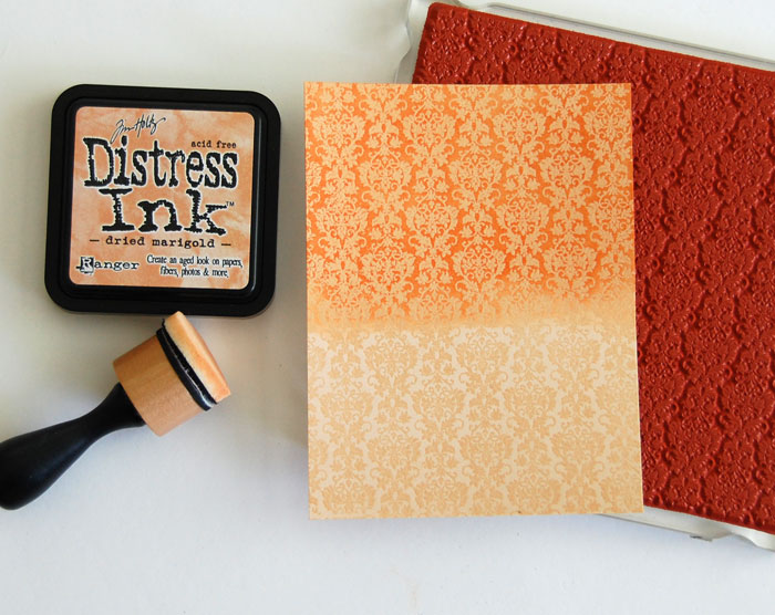
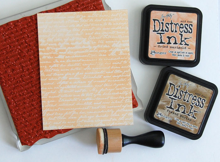
5. Resist with color
On the sample above, I used the same resist technique but stamped with VersaMark onto colored cardstock instead of white. I clear embossed with matte embossing powder (not shiny), then sponged on distress ink. The bottom portion of the cardstock is simply embossed with the top half sponged over with distress ink, creating two different looks.
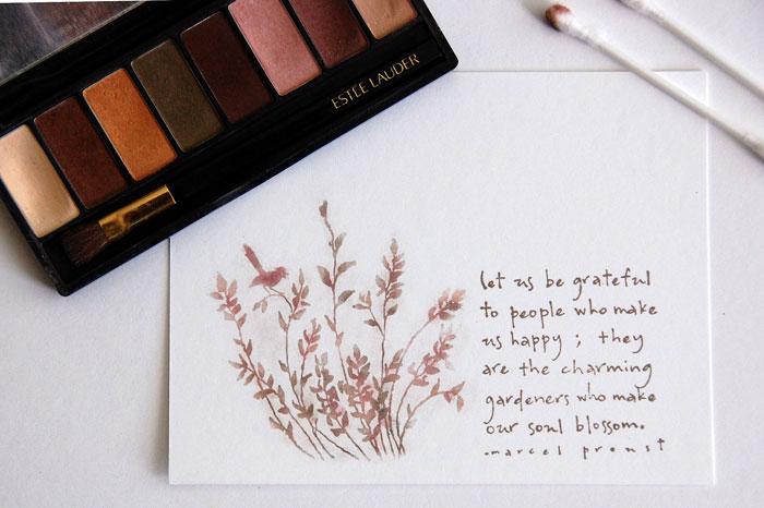
6. Poppin’ Pastels (or eye shadow)
With the Poppin’ Pastels technique, VersaMark is stamped onto cardstock and pastels are lightly brushed or daubed over the sticky ink to reveal the design.
I could not find my pastels so I used eye shadow with identical results. I used a cotton swab to add color, then used a clean cotton swab to remove a bit of the extra powder from around the image. Once completed, I wiped my finger across the powdered design and it did not smear. I recommend adding color very lightly at first until the design is visible, then add darker colors where desired. It’s a fun technique!
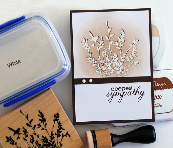
7. Emboss with shadow
Dimension and shadow can be created by stamping an image or sentiment in dark ink, then embossing white slightly offset from the original.
To achieve the look above, stamp an image in dark brown ink. Use a stamp positioner (i.e. Stamp-a-ma-jig) to determine the placement of a second, slightly offset impression. With stamp positioner still in place, pounce powder tool over the entire image then stamp the second impression using VersaMark. White emboss then sponge over with a lighter ink to make the image pop.
FREE Guide: Innovative Ideas for Creative Paper Crafts

Try these four trendy techniques for stunning projects that shine.
Share tips, start a discussion or ask one of our experts or other students a question.
No Responses to “7 Reasons Why Every Stamper Should Be Using VersaMark”