
Practicing a skill to improve your abilities can sound like the most boring way to spend your time. But today, I’m going to recommend watching movies, which is probably something you’d like to do anyway.
When someone describes an image as “cinematic”, it evokes a sense of expansiveness, inventiveness and narrative. These are all often attributes we pursue in illustration and other still-image creation. What better way to capture some of that compelling storytelling than to study films for the way their directors create those powerful images?
Drawing composition
Some directors stand out in the category of composition. One who gets a lot of praise is Steven Spielberg, and for good reason. His films are carefully planned, and his storyboards — or visual scripts — lay out his shots for the film.
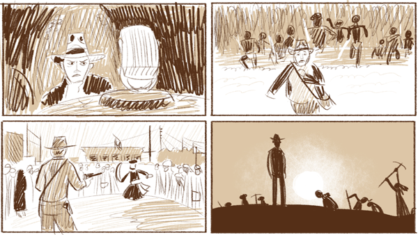
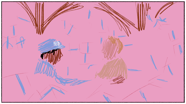
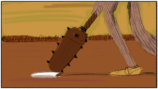
In these sample stills that I have drawn from Raiders of the Lost Ark, you can see how he is composing each scene to show relative importance (or perhaps relative danger). In the classic sword vs. pistol scene, you can also see an example of how he uses costuming to make the swordsman (in black) stand out from the crown of white-clad onlookers (with the exception of the woman in black on the far left, balancing out the scene.) In the final still, I’ve pulled up one of the starkest images — it almost looks like a comic panel, and I believe that is intentional for our all-but-superhero Indiana Jones. Enjoy 140 ideas that will jumpstart your imagination and help you create inspired drawings.
FREE drawing prompts for more creative art

Color and composition
Another master of composition is Alfred Hitchcock. His storyboards were like gospel, and the shots for the film were setup to match his pre-planning as exactly as possible — from sets, to costuming, to blocking, and even seemingly incidental objects. Nothing is in the scene accidentally. You can compare his storyboards to the final film, and follow the story precisely.
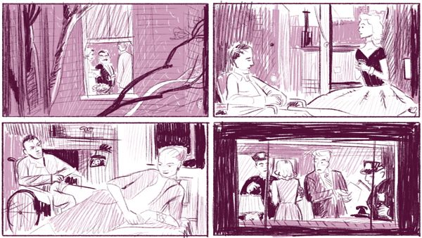
In Rear Window, those titular windows are a visual device throughout the film. Everything within the frame is framed again to carry the film’s mood of constriction and confinement through to the audience. It’s a brilliant way to put the viewer into Jimmy Stewart’s cast and wheelchair, stuck in his apartment in the summer’s heat. The tension is amplified, and we feel the hero’s desperation in each of the final climactic scenes.
Beyond Hitchcock’s compositional brilliance is his careful and deliberate use of color. Featured actors in a scene can be brought forward with a red tie, or a pair of characters carrying equal importance can be set on even ground with similar color cues that pop out of the background, assembled in complementary colors. Vertigo is a story told with the full capability of the then-new technology of Technicolor. If you are curious about how color can amplify or alter the effectiveness of the composition, Hitchcock has left us a library to study. Pick one of the films and scroll through to see frame after frame of great visual design.
Advanced study
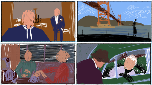
There are few, if any, contemporary filmmakers who create their scenes as carefully and deliberately as cinematic descendant of Alfred Hitchcock, Wes Anderson. The trick with Anderson is that he has the benefit of several more decades-worth of shoulders to stand on in addition to Hitchcock’s.
Anderson is not only in control of the best film practices, but he can push and play with those conventions. Wes Anderson is known for his quirky and awkward camera, which commits the compositional sin of centering the subject in the frame. And he does it over and over again — so much so that it is a kind of signature style.
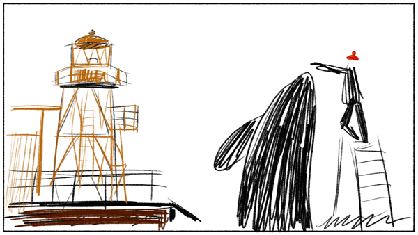
But if you dig enough you can find a variety of other great compositions in his film as well. In this Life Aquatic still, I love the rhythm of vertical shapes, and the silliness of Steve Zissou’s red hat echoed in the tip of the yellow lighthouse tower.
Many more directors are skilled in composition and color, like the Joel and Ethan Coen or Stanley Kubrick. Many sci-fi and fantasy films take place in invented worlds, and are filled with wonderful layouts and colors. Animation is all created from whole cloth – a couple of my favorites to look at are the television series, Samurai Jack, or Disney’s original 101 Dalmatians.
What are your favorite films? Are they worth drawing?
FREE drawing prompts for more creative art
Enjoy 140 ideas that will jumpstart your imagination and help you create inspired drawings.
Share tips, start a discussion or ask one of our experts or other students a question.
No Responses to “How to Use Film Stills to Improve Drawing Composition”