
Color is such an important part of everything we create. In embroidery, designers provide thread color charts for their machine and hand embroidery patterns. The color palette is a just a suggestion. Step outside your comfort zone and see how easy it is to expand your creativity by choosing thread colors outside your comfort zone!
Here’s some ideas selecting color choices for your embroidery design.
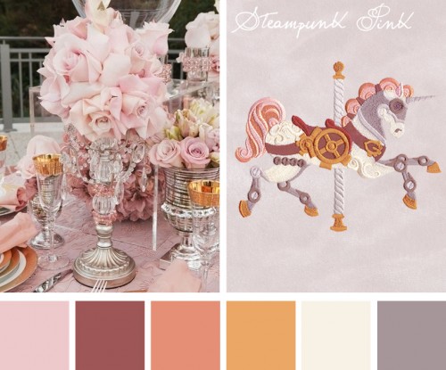
Steampunk Pink color theme with Steampunk Carousel Unicorn; Photos via Urban Threads
You may believe that the color aspect of embroidery is much too artistically complicated to wrap your head around. Truth is you do not need an art degree to successfully play with color. Some of the talented designers at Urban Threads have provided templates you can easily adapt to your own embroidery.
See a photo you like? Match embroidery threads to it.
Color adaptations are all around us: magazines, television, internet. If you see a color combination you like, use it in your embroidery. These examples were featured in the Color Inspirations segment of Urban Threads’ blog Stitch Punk. All of the designs shown are available for machine embroidery and hand embroidery.
Neon: Midnight confetti
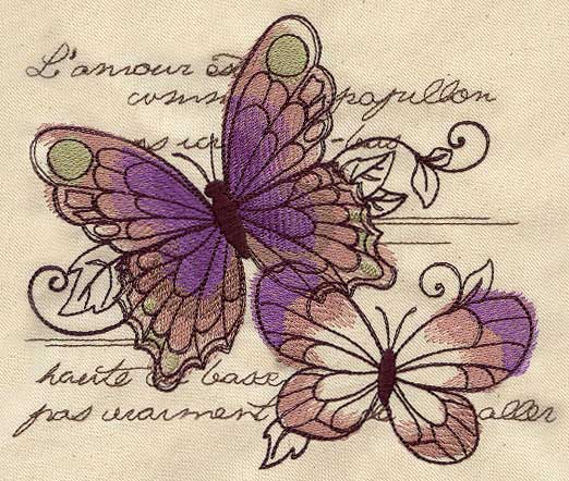
The Parisian Butterflies design uses seven thread colors but is basically created with three shades: two purples, three browns, and a green.
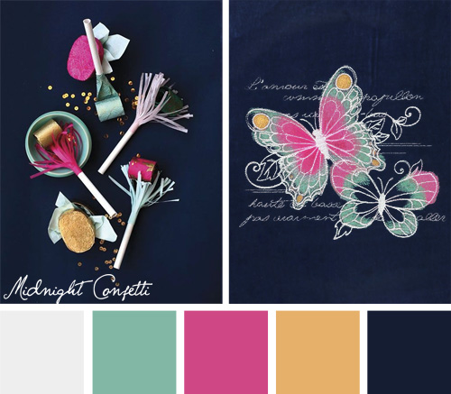
While it is quite lovely as it is, if your decor features more blues, grays, and pink, then the Midnight Confetti colorway is spectacular. The new colors stand out particularly well against a black background.
Brights: Summer Sunrise
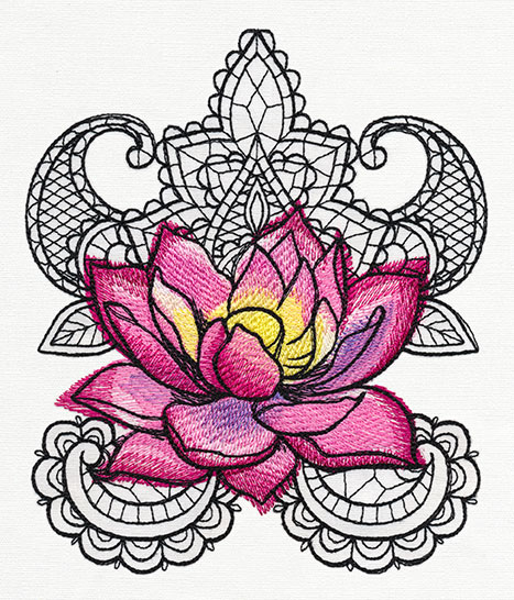
Traditional goes tropical with the Painted Lotus design. You would not think of lotus flowers as anything but pink and purple.
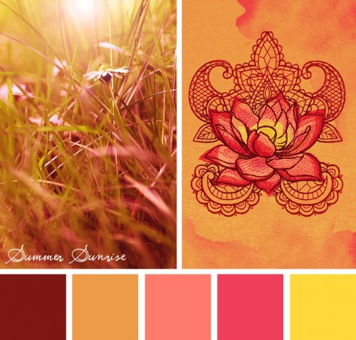
But when the palette is switched to the oranges and corals of Summer Sunrise, the result is beautiful. What makes the new color combination work even better is that the background tie die fabric is a perfect match.
Stellar: Violet Ruin
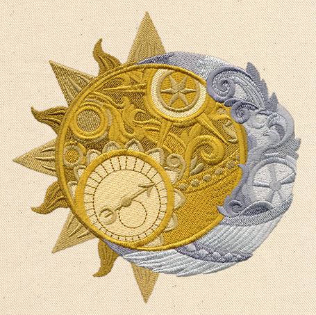
Take “typical” to “out of this world.” Clockwork Heavens originally used seven thread colors in the polished metal version.
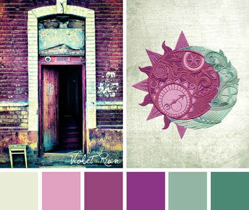
Three shades of violet, two of teal, and one of grey pulled from the Violet Ruin color theme, combine to make the cosmic steampunk even more stellar. The design could be framed to look like custom artwork or stitched on a pillow as an accent piece.
Fun to Elegant: Morning Harvest
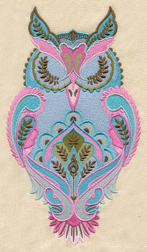
Owls have made a comeback and the Full Moon Owl is colorful and fun. In pink, green, and blue, it would be an ideal accent for a baby room.
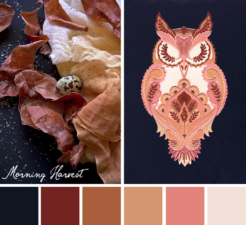
When using the colors of the Morning Harvest theme, the owl now becomes very elegant.
Holidays: Royal Christmas
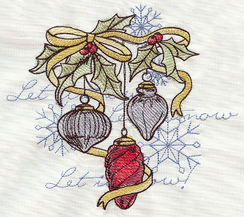
Perhaps no colors are more traditional than the green and red of Christmas. In that respect, Yuletide Revelry – Ornaments are digitized to be stitched in red, green, silver, and gold.
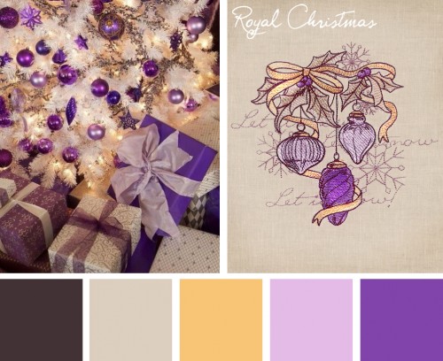
Red, green, and gold is perfect, unless your tree is decked out in white and purple. Changing to the grey, gold, and purples of Royal Christmas adds a designer quality to the embroidery.
Do not be afraid of trying different color combinations. What is the worst that can happen? You can throw away any test stitch outs you do not like.
Share tips, start a discussion or ask one of our experts or other students a question.
No Responses to “Picture Perfect: Choosing Color Variations for Embroidery Designs”